Sometimes I feel like white paint gets a bad rap—it can immediately bring to mind an overly cool, minimal, modern space (that’s certainly what it used to mean to me). But once you dig into the nuances of white paint, you’ll see it has so much to offer for every mood, space, and aesthetic. (Keep reading for how to choose the perfect white paint color for your space!)
Below is a list of my favorite white paint colors, along with tips to help you get it just right.
And yes—every color below has been recommended to clients and used in my own homes.
Our Favorite White Paint Colors
Sherwin-Williams White Paint Colors
Creamy (SW 7012)
A beautiful, timeless bright white with subtle yellow undertones. This is a great off-white that’s easy to live with and simple to pair with other colors.
Westhighland White (SW 7566)
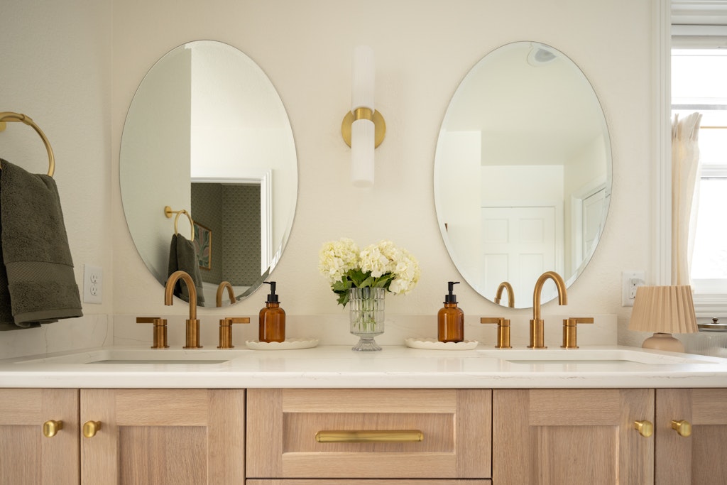
A creamy, bright white that feels warm and inviting. It pairs especially beautifully with oak trim and natural wood tones.
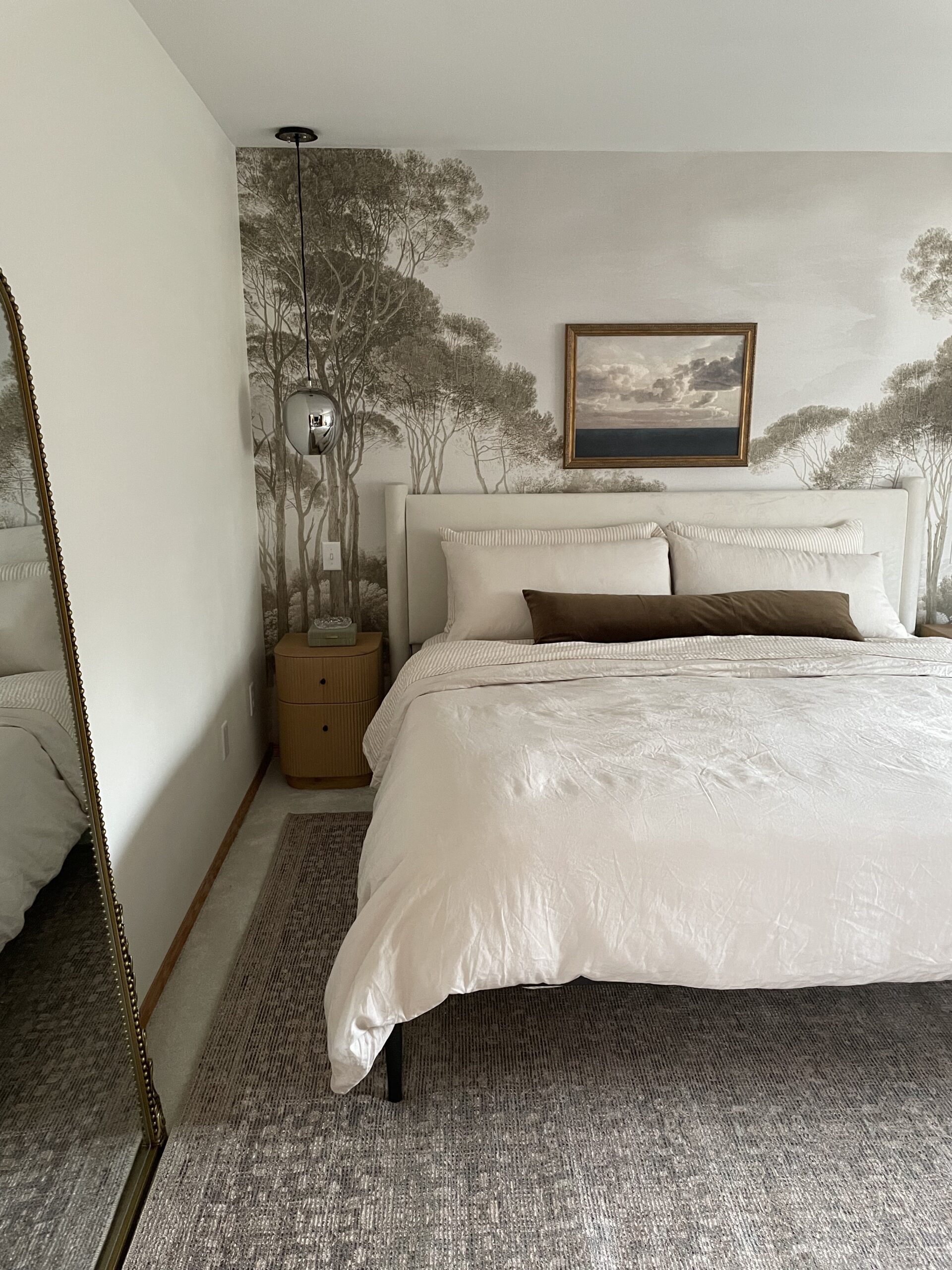
Alabaster (SW 7008)
A very popular choice—and for good reason. Alabaster is soft, warm, and balanced, making it a great option for both timeless and modern spaces.

Greek Villa (SW 7551)
Another bright yet warm white, Greek Villa has subtle yellow undertones and works well in spaces that need softness without feeling heavy.
Shoji White (SW 7042)
The darkest of our Sherwin-Williams picks. Shoji White is super warm, creamy, and muted—bordering on greige and perfect for cozy, layered interiors.
Benjamin Moore White Paint Colors
White Dove (OC-17)
A go-to classic. White Dove is clean, soft, and incredibly versatile, which explains its enduring popularity.
Swiss Coffee (OC-45)
Warm and inviting with yellow-beige undertones, Swiss Coffee is ideal for spaces where you want an approachable, lived-in feel.
Moonlight White (OC-125)
A versatile white with muted silver-green undertones. This one shifts beautifully depending on light and surrounding materials.

Natural Cream (OC-14)
An off-white that works with both warm and cool palettes. One of our darker recommendations, it sits right on the edge of a light greige.
Simply White (OC-117)
One of the brightest whites on this list. Simply White is crisp and clean with a subtle warm undertone that keeps it from feeling stark.
How to Choose the Right White Paint
So—you’re ready to move forward with painting your space white.
Where do you begin? With the mood, of course.
What do you want the room to feel like when you walk in? Sophisticated and modern? Cozy and inviting?
If you’re going for a more modern look, stick to a brighter white (that may or may not lean cooler). This will make the space feel sleeker and brighter.
For a room that’s a bit more moody and layered, creamier and/or darker whites are the way to go to make the space feel cozier.
Not sure what you want? Start with a list of how you want the room to feel and start gathering those inspiration photos (think Pinterest, magazines, IG). These two exercises will tell you a lot about what aesthetic you’re most drawn to.
A Note on Color Drenching (Yes, Even With White)
When recommending a white paint color, I often suggest color drenching the space—and yes, this absolutely works with white paint. It’s not just reserved for dark, moody colors.
Instead of choosing a brighter white for trim, doors, and ceilings (a look that, in my opinion, has been a bit overdone), you can use the same white throughout the space. The key is varying the sheen:
-
- Walls & ceilings: satin or eggshell
-
- Trim & doors: semi-gloss
This creates subtle contrast while keeping the space cohesive and elevated.
Paint Chips + Samples (Please, Please, Please Sample)
For all that is holy and mighty—please sample your paint colors.
I say this not only as an interior designer, but from personal experience (I’ve been painting my own interior spaces for nearly 15 years). Paint colors can look dramatically different depending on light, and the last thing you want is to paint an entire room—or hire it out—only to dislike the end result.
Start with paint chips and tack them on the wall. Look at them throughout the day. Once you’ve narrowed it down to a few favorites, move on to sample paint pots or peel-and-stick samples (my personal preference on projects).
Live with them for a few days. Observe them in different light. Trust the process—it’s worth it.
👉 To read more about how light direction affects paint color, check out our blog post on choosing paint based on room orientation here.
Final Thoughts on White Paint
I hope you enjoyed my many thoughts on white paint (who knew I had so many?!) As always, we wish you the best on your design journey.
If you’d like support navigating the many decisions involved in creating a cohesive, thoughtful home, we’d love to chat. You can book your discovery call here.
Thanks so much for reading.
This post handcrafted with care by a real human in the Mountain West